FORMULA E
FORMULA E
Every design discipline. Thousands of touchpoints.
Fifty million new fans.
I led the complete rebrand of the FIA’s globally recognised sustainable electric racing series with the goal of capturing broader, younger and more diverse audiences around the world.
Created entirely in-house, I expanded the three-strong design team into eleven permanent 2D & 3D creatives, animators and producers without affecting the annual budget — improving the company’s diversity & inclusivity and staff retention as well as building team culture and skill sets.


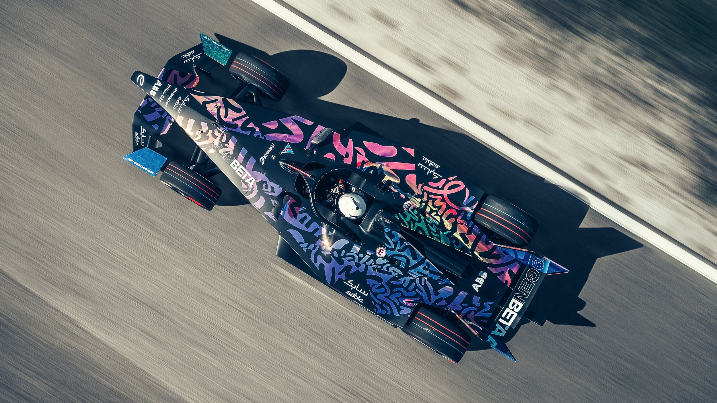
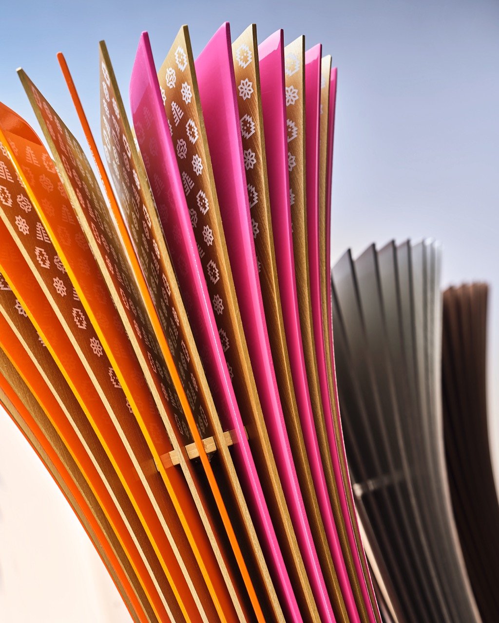
The Torque Loop.
To bring the concept of Electric Acceleration to life, a natively-three-dimensional, animated graphic system was developed.
The Torque Loop is an ever-moving graphic device representing the restless energy at the core of the brand and the sport.
Constructed around a perfect mathematical shape, this regenerative and self-sustaining loop is the source of the new logo, typeface, design system, and the brand’s new animation principles.
Linking the concept to the identity to the logo and back again, imbuing everything with electric acceleration.


Uniformly unique
in every city.
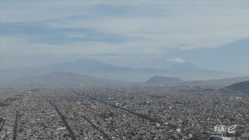
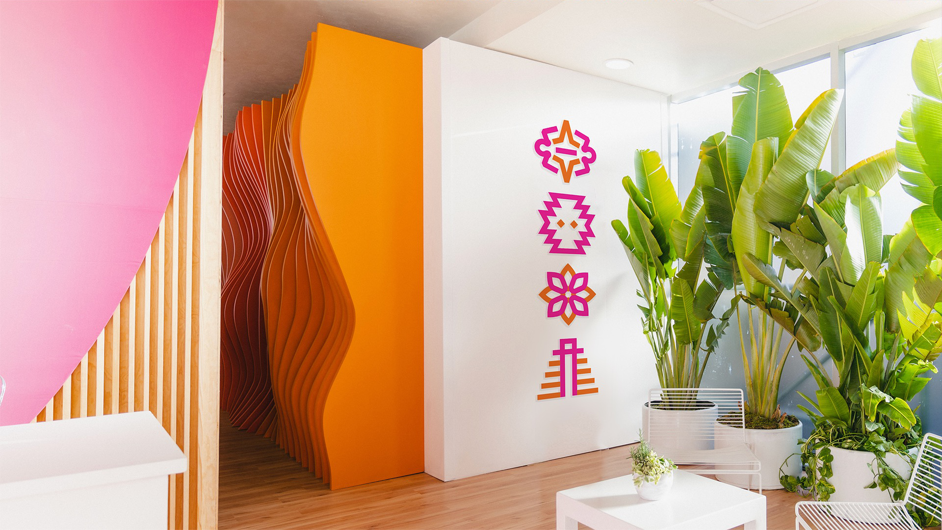
Racing in some of the most eclectic and distinctive cities in the world, from the vibrancy of Mexico City, the design of Berlin, the elegance of Monaco or the festival of Sāo Paulo, Formula E needed a way to bring that unique flavour of each city natively and as a core part of the identity.
However, any system needed to be easily replicable, merchandisable, animatable and extensible, with new cities added to the calendar each season.
A system of four unique icons and two colours based on the culture, architecture, food, flora and fauna of each location was designed to represent each city rather than each country. This was to be a celebration of cities.
More than fifty icons have been approved into the system so far, with hundreds more designed along the process.


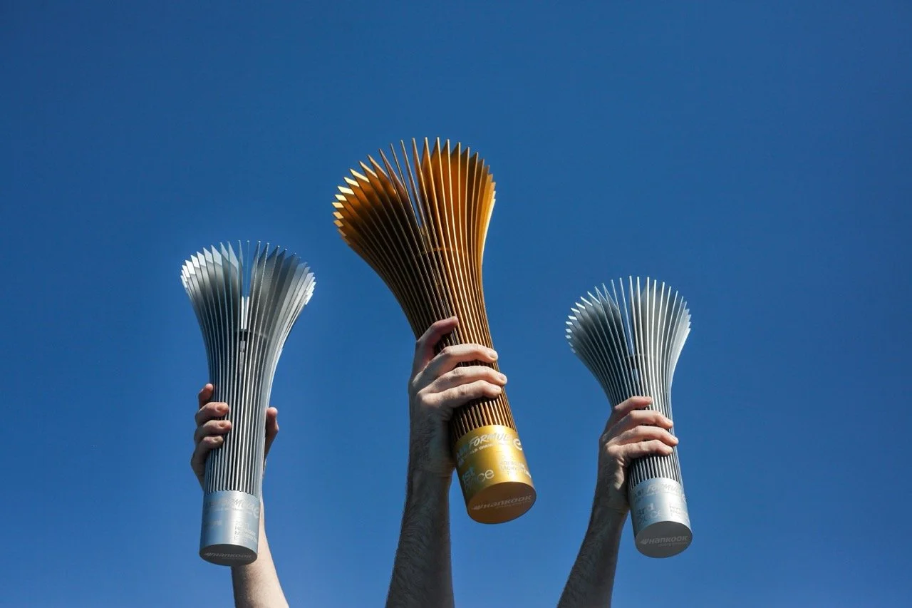
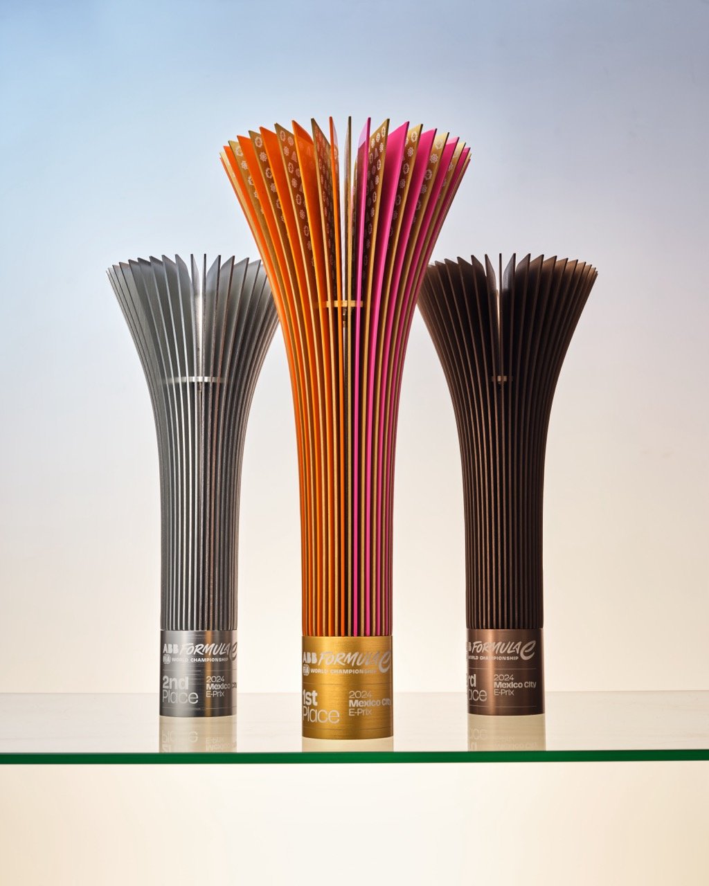
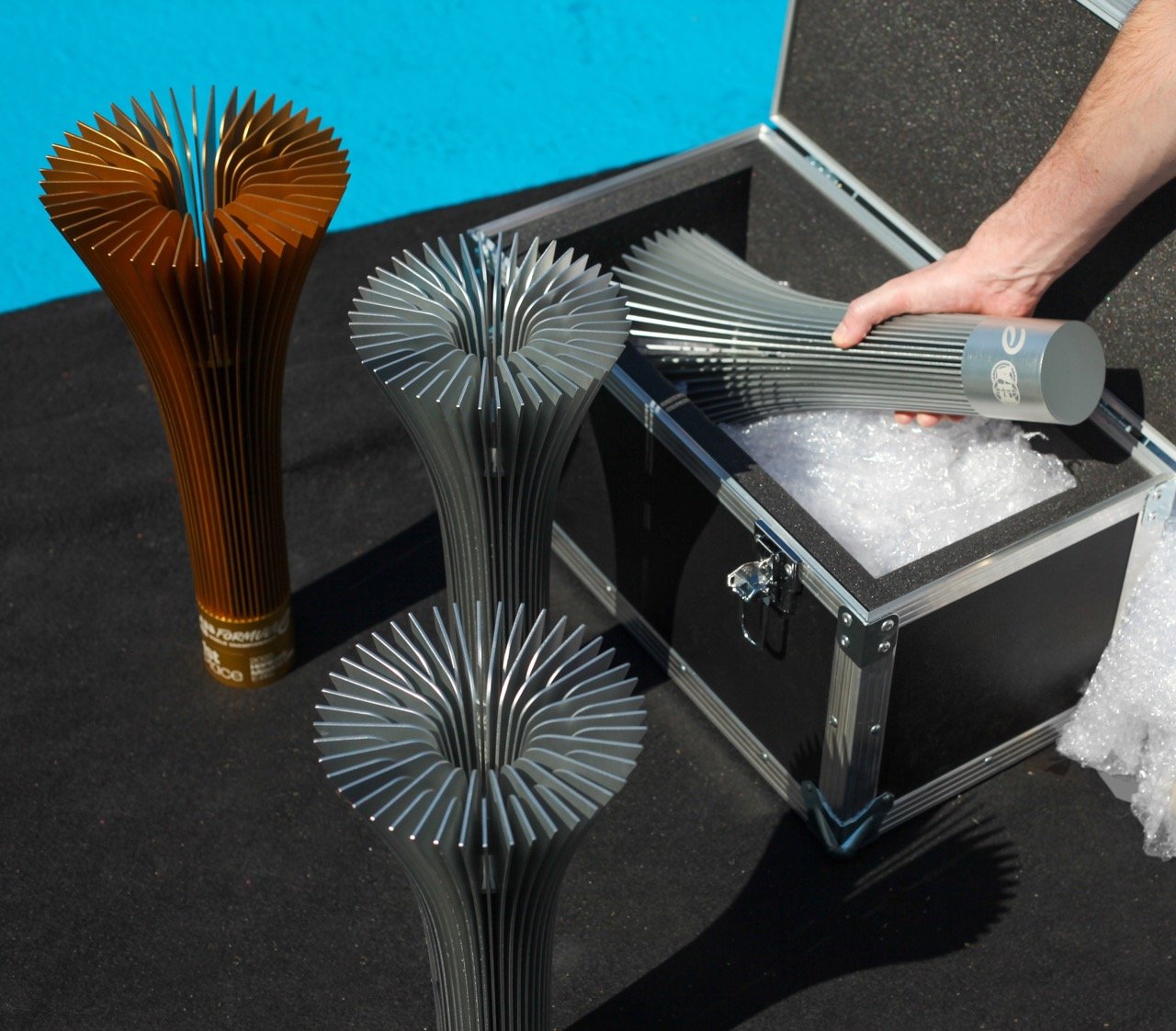
The pinnacle of
electric racing.
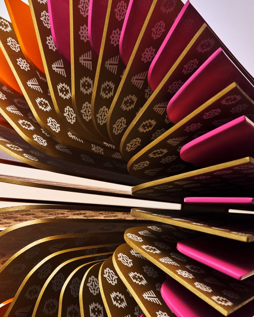
The pinnacle of electric racing needed a suite of trophies as brilliant as the racing. Working with the industrial designers at Beta Design Office, I oversaw the design of a trophy that felt inherent to electric acceleration. Avoiding tropes and making an icon of the sport.
Long swooping curves from the Torque Loop graphic language of the master identity are combined with refined aluminium leaves evoking both electric heat sinks and heavy-duty electric cabling.
All of this comes together to create a clean, sweeping shape that is very satisfying to hold and a clear identifiable icon of the sport on screen and in the sports pages.
Each winning trophy is painted and engraved with the local city colours of each destination, adding visual interest and addressing ‘winning fatigue’ — the feeling that a dominant driver has of lots of identical trophies.


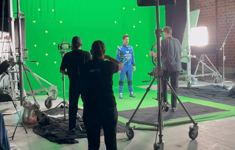
22 drivers.
Four concurrent shoots. One day.
School photos on an international scale. Formula E shoots each of the 22 drivers each year, capturing every still for all the promotional and production needs of the sport, and all the green-screen motion needed for a complete broadcast package.
Previously hastily done in a Portacabin just off the side of the track during winter testing, we changed it to be an all-encompassing day for the drivers, a dedicated professional studio hangar with four complete shoot set-ups in a tight rotation to capture everything needed to a much higher standard than ever before, with relaxed, confident drivers and some of the best shooting talent in the world.
Extended to every
part of the brand.
As part of rebranding the company, the head offices in Hammersmith were given a full glow-up to bring the new brand to life for the 200 people working there. Careful consideration was given to the materials, lighting, planting and layout to bring both a sense of calm to the working space while still bringing the vibrant, electric acceleration of the sport to life.
All the work was done over a holiday weekend aligned with the global launch of the new brand identity — everyone working at Formula E saw the old brand when they went home for the weekend and the new brand when they next came in.


Every design discipline.
Thousands of touchpoints.
Fifty million new fans.
Thousands of touchpoints were designed all within the new system across every discipline, and the whole brand, from the digital platforms, social channels, teams and manufacturers ecosystem, broadcast, merchandise and even the head office branding switched over on a single day.
After the first twelve months, viewership was up 22% YOY with growth coming from a younger, more gender balanced audience, with fans describing the new brand as ‘vibrant’ ‘exciting’ and ‘modern’ and over 90% preferring the new brand identity.